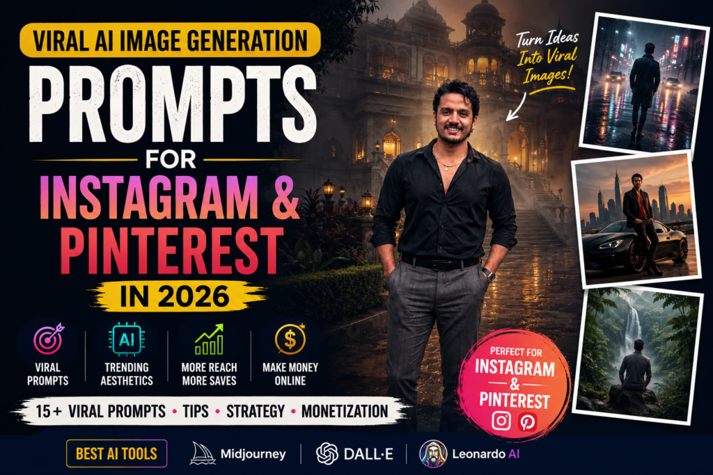
Scroll through Pinterest or Behance right now and you’ll notice something odd happening in the fashion corner of the internet. People aren’t just posting portraits anymore. They’re posting portraits that look like they’ve torn their way out of a designer’s private sketchbook — full-body editorial shots framed by tailoring notes, fabric swatches, and pencil sketches, all sitting under a ripped sheet of paper like the page couldn’t quite contain them.
It’s become one of the most shared AI art formats on Instagram and Pinterest this year, and once you understand why it works, it’s hard to unsee.
What Exactly Is a Concept Board, Anyway?
Long before AI got involved, fashion designers were already building these. A concept board — sometimes called a mood board — is the tool designers use to plan a collection before a single stitch gets sewn. Garment sketches, fabric samples, color swatches, measurements, styling notes, all pinned together to show where a collection is headed.
What’s happening now is that AI tools have taken that very functional, very industry document and turned it into an art form in its own right. The subject of the photo becomes the “inspiration” behind an imaginary collection, surrounded by all the paperwork a real design house would generate. It’s part illustration, part photography, and it reads as something a creative director might actually pin to a studio wall.
The Torn Paper Is Doing the Real Work
Take away the ripped-paper effect and this trend probably doesn’t exist. It’s the detail that turns a flat collage into something with real depth.
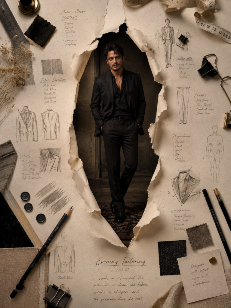
Instead of dropping the subject onto the page like a sticker, the composition treats the sketchbook as if it’s been physically torn open — curled edges, visible paper thickness, a shadow falling exactly where a real tear would cast one. Underneath, a full editorial photograph shows through, lit like it was shot for a campaign rather than generated by a prompt.
That contrast between the flat, hand-drawn page and the dimensional photo breaking through it is what makes the eye stop scrolling.
Why Getting the Face Right Matters More Than Anything Else
None of the styling matters if the person doesn’t look like themselves. This is the part of the process that’s easiest to get wrong and most damaging when it goes wrong — a portrait that’s stylistically stunning but subtly “off” in the face will always read as fake, no matter how good the paper texture is.
For a result worth using in a portfolio or on a personal brand page, the generation needs to hold onto the actual bone structure and features of the reference photo: the shape of the face, eye and brow structure, nose, lips, hairline, skin tone, and the expression the person naturally makes. Anyone building this for a client or their own following should treat identity accuracy as the non-negotiable part of the brief, not an afterthought.
Why It Reads as “Luxury” Instead of Just “Busy”
There’s a version of this trend that goes wrong — cluttered, over-decorated, trying too hard. The versions that actually look premium borrow a page from how luxury fashion houses operate: restraint over excess.
The sketches surrounding the subject aren’t random decoration. They’re the kind of thing a real technical designer would produce — blazer construction studies, trouser silhouettes, proportion diagrams, pencil shading with handwritten notes and direction arrows in the margins. Add in a few tactile props (a metal ruler, measuring tape, a fabric swatch, a binder clip holding a few loose pages together) and the whole thing starts to feel less like a digital collage and more like a workspace someone actually used.
The color story matters just as much. Warm ivory, soft beige, linen, charcoal, graphite — nothing saturated, nothing loud. That restrained palette is doing a lot of the “expensive” feeling on its own, before the lighting even comes into play.
Lighting Is the Difference Between “AI Image” and “Campaign Shot”
Soft, directional light — the kind you’d see in an actual fashion editorial — picks up the texture in the paper fibers, the pencil shading, the fabric grain, and the subject’s features all at once. Harsh, flat lighting flattens everything and is usually the fastest way to make an otherwise good composition look artificial. If there’s one variable worth spending extra prompt effort on, it’s this one.
Who Actually Uses This Style
This isn’t just for working fashion designers. It’s shown up in the portfolios and feeds of:
- Fashion and lifestyle influencers building a personal brand
- Photographers and models padding out a portfolio
- Creative directors pitching a visual direction
- Independent clothing brands and small labels
- Editorial and lifestyle pages looking for scroll-stopping content
Anyone who needs to communicate “I understand fashion at a professional level” through a single image has a reason to try this format.
Where It Performs Best
Unsurprisingly, this style does best on the platforms built around visual discovery — Instagram, Pinterest, and Behance in particular, along with fashion-focused portfolio sites and digital lookbooks. The format rewards close inspection: people linger on the little sketches and handwritten notes longer than they would on a standard portrait, and that extra dwell time tends to translate into better engagement.
Getting Good Results: What Actually Moves the Needle
If you’re building one of these yourself, a few things consistently separate the results that look premium from the ones that look like a generic AI collage:
- Start with a clear, high-resolution reference photo. The AI can only preserve detail that’s actually visible in the source image.
- Treat facial accuracy as the priority, not a secondary detail to fix later.
- Choose clothing that fits the editorial mood — tailored, simple, nothing that fights with the sketchbook aesthetic around it.
- Leave breathing room in the layout. A page that’s too full stops looking handcrafted and starts looking cluttered.
- Stay inside the neutral palette. Ivory, beige, linen, charcoal, graphite — resist the urge to add color for its own sake.
- Get the paper physics right — shadows, curl, thickness. This is what sells the illusion.
- Use real design language in the sketches and notes, not decorative squiggles. Annotations should look like something a designer would actually write.
- Finish with soft, editorial-style lighting to tie the whole composition together.
The Bottom Line
What makes this trend stick around isn’t the novelty of AI art — it’s that it borrows the visual language of an industry people already associate with craftsmanship and taste, and applies it to a personal portrait. The torn paper adds drama, the sketches add credibility, and the restrained palette adds the sense that someone thought carefully about every element instead of throwing filters at a photo.
Done well, it doesn’t look like an AI-generated image at all. It looks like a page torn out of a fashion house nobody’s heard of yet.