Written by Kanchan Kaswan, 22
AI artist and prompt engineer. I mess around with cinematic AI portraits way too much and occasionally write about it.
Someone in my DMs last week asked how I get the “same guy” to look like a Gulf falconer in one shot and a soaked, brooding street kid in the next. My first instinct was some slick one-liner. Then I actually thought about it and realized the real answer is way messier, so here it is properly.
Same face, four worlds. A luxury falconer editorial. A black-and-white portrait with a broken frame concept. A rainy night triptych near a parked SUV. A clean studio shot with a motion-blur trail. None of it came out right on the first try. Some of it didn’t come out right for a genuinely annoying number of tries. Here’s the mess behind each one.
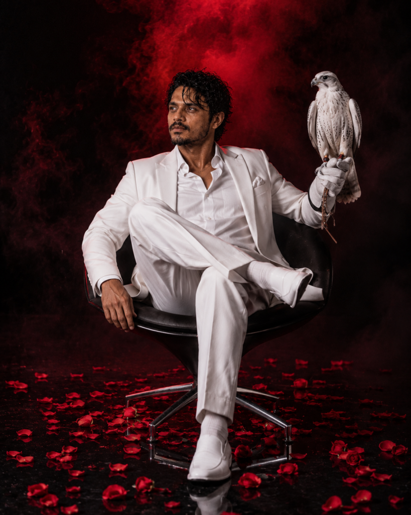
The falconer shot
Screenshotted the most. Fought with the most too. First few generations, the white suit kept coming out looking like hospital scrubs. There’s a razor thin line between “tailored three-piece suit” and “guy about to check your blood pressure,” and the model kept crossing it, over and over, no matter how many fabric words I threw at it.
What actually fixed it was giving up on describing the suit at all and focusing on rim light and shallow depth of field instead. Suddenly it looked like a Vogue Arabia spread. The falcon, honestly? Kind of an afterthought. I threw it in because “guy in white suit sitting in a chair” needed something else in frame, and it happened to land perfectly. Reads as old money in a way no watch ever does.
Red smoke is a trap by the way. Ask for “swirling ethereal smoke” and the model eats your subject alive with fog, every time. Dialed it down to almost nothing in the end. Less description, better photo. Still not sure why that works the way it does.
The frame that isn’t really a prompt win
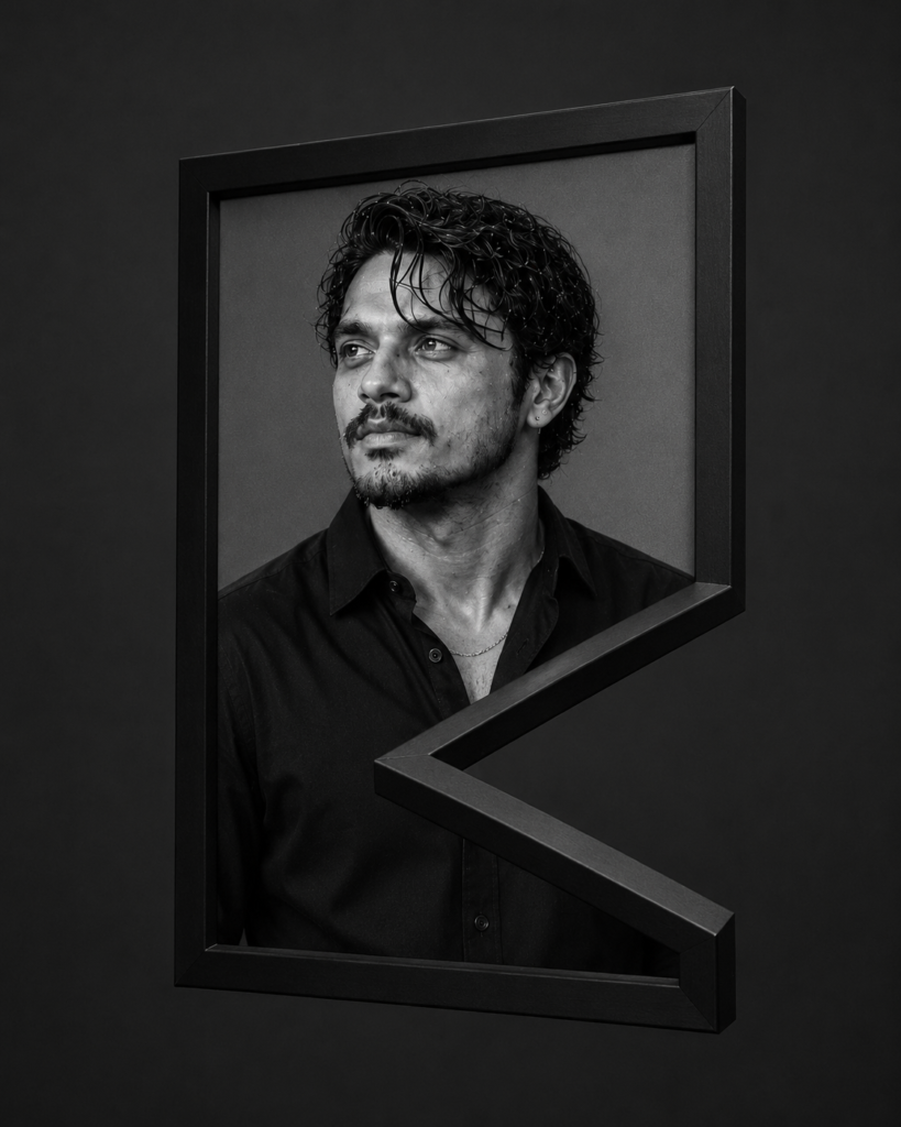
People assume this one is some genius prompt. It’s not. The portrait — wet curls, three-quarter angle, unbuttoned shirt, grey backdrop — is deliberately boring, on purpose, because the frame concept was going to carry the whole thing.
Asking directly for “a bent picture frame” is a nightmare. You get warped wood, cracked glass, melted-looking textures, none of which read as intentional, all of which just look broken. So: generated the portrait clean, separately, then handled the frame geometry on its own and composited the two in Photoshop, matching the wall shadow to the light direction in the photo. That single shadow-matching step is the entire reason it doesn’t look like a bad cutout job. Skip it and it falls apart in about half a second.
This is the one I’m proudest of and it’s got the least “prompting” in it. Mostly compositing. Mostly patience, actually.
Rain, an SUV, and way too many soggy attempts, and also — unrelated — why does every rain reference photo on Pinterest look like it was shot through a shower door
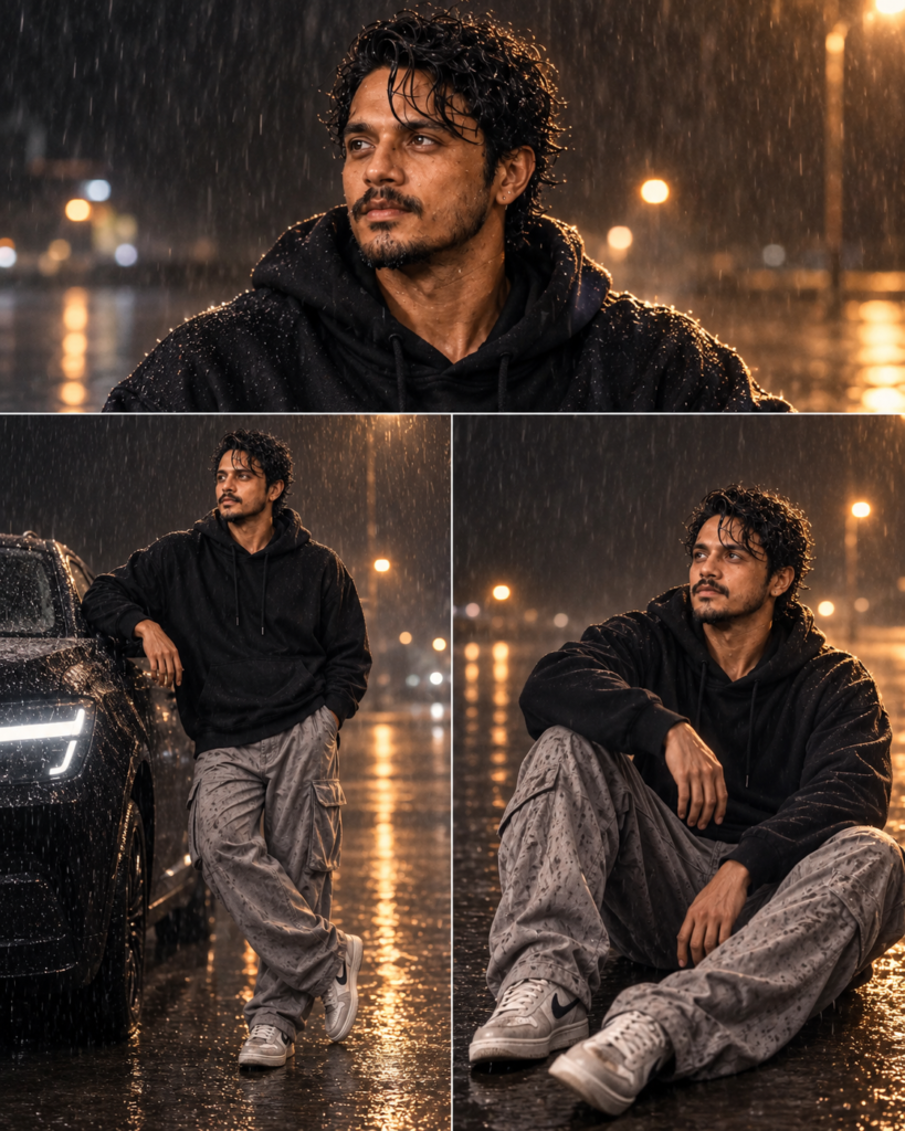
This triptych nearly broke me. Rain is deceptively hard to fake. Early attempts looked like Vaseline on a lens, or a cheap filter over a bone-dry photo. What actually reads as real: warm sodium streetlight against cool wet asphalt, actual droplets sitting on skin instead of streaks floating in the air, bokeh trails in the back from other lights. Miss one and the whole thing looks like a filter.
Also — and this is a tangent but it’s been bugging me for months — half the “cinematic rain” reference images people post for inspiration aren’t even real rain photography, they’re stock photos shot with a hose off-camera and a fan blowing mist, which is a completely different lighting setup than actual falling rain, and I think that’s part of why so many AI rain attempts look wrong, people are training their eye on fake references to begin with. Anyway.
Don’t ask for “moody” or “sad” directly. You get this weird theatrical pout, like a bad perfume ad. Describe the physical conditions instead — wet hoodie, low angle, warm-cool contrast — and the mood shows up on its own, uninvited, which I did not expect to be true but it’s been true every single time.
The three-panel layout came after everything was already generated. I was just sitting there with three good shots trying to figure out how to stop them from competing with each other. That’s editing. Not prompting. People underrate how much of “cinematic” is really just smart layout decided after the fact.
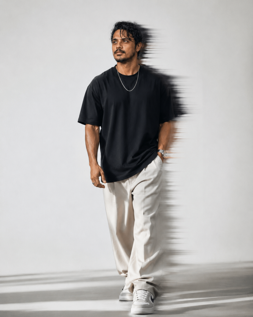
The motion blur shot
Quiet one. Took forever, for a completely different reason than the others. Idea: guy mid-stride, blurred ghost trailing behind him like the shutter dragged. Real photographers call it shutter drag — slow shutter, flash, done.
Getting a model to understand that only part of an image should stay sharp while the rest streaks and fades is genuinely hard. Early tries either blurred everything (useless) or put the trail going the wrong direction, which sounds tiny but wrecks the whole effect instantly. Wrong direction and your brain reads it as a rendering glitch, not motion. Twelve or so regenerations before the trail and the sharp anchor point lined up right. I lost track of the exact number honestly, somewhere around there.
So what’s the actual takeaway
None of these worked because of some secret magic prompt. They worked because I kept translating real photography — rim light, shutter drag, shadow direction, warm-cool contrast — into words instead of reaching for mood adjectives. “Moody,” “dramatic,” “ethereal” — the model treats those lazily, gives you back something lazy. Technical, physical description is what actually produces emotion in the output. Still find that a weird thing to type out loud, but it’s held up every time.
FAQ
What tools are you actually using for this?
A mix, depending on the shot. The core idea — describe lighting and physics, not adjectives — carries across pretty much anything I’ve tried it on.
How many attempts does something like this usually take?
More than people expect. Falconer shot took 15-20 generations before the suit stopped looking medical. Motion blur took even more, because trail direction is so unforgiving.
Is the frame composite done in Photoshop?
Yeah. Built as two separate pieces, combined after, shadow direction matched by hand. That part isn’t a one-shot AI thing, at least not yet.
Why does “moody” or “sad” backfire as a prompt word?
Produces this exaggerated, theatrical expression instead of anything subtle. Describing the physical conditions that would naturally create a mood gets you there without the overacting.
One thing you’d tell someone starting out with this?
Stop describing feelings, start describing physics. Where’s the light coming from, what’s reflecting, which way is something moving. The mood takes care of itself, annoyingly reliably.