Somewhere between 2024 and now, birthday posts quietly got a glow-up. Nobody wants a generic Canva template with confetti clip-art anymore. Scroll through Instagram right now and you’ll notice it — those elegant, magazine-style birthday portraits that look like they were shot by a fashion photographer, not generated by an app.
That’s exactly the design we’re breaking down today.
It’s not flashy. It’s not loud. It doesn’t need balloons or glitter fonts to make an impact. Instead, it does something smarter — it borrows straight from luxury fashion editorials and turns a birthday wish into something that actually looks like it belongs on a magazine cover.
Here’s exactly what makes it work, and how you can recreate it yourself.
Why Everyone’s Suddenly Obsessed With “Quiet Luxury” Birthday Posts
There’s a bigger shift happening in design right now, and it’s spilling over into birthday content too. People are tired of “more is more.” Bright colors, cluttered layouts, ten different fonts screaming for attention — it’s exhausting, and honestly, it ages badly.
Minimalist birthday posters do the opposite. Clean white space. Balanced spacing. One strong portrait doing all the talking. It instantly reads as expensive, even though it costs nothing but a good prompt.
And the best part? This style never goes out of fashion. A confetti-covered birthday template looks dated within a year. A monochrome editorial portrait still looks sharp five years later.
This is why it’s showing up everywhere:
- Birthday wishes and captions
- Instagram feed posts and Stories
- WhatsApp status updates
- Facebook cover photos
- Pinterest boards
- Printed gifts and canvas frames
- Digital invitations
Basically, anywhere a normal birthday post would look forgettable, this one gets stopped-scroll attention instead.
The Secret Is Editorial Photography, Not “AI Photography”
Here’s the giveaway that separates an amateur AI image from a scroll-stopping one: does it look like a selfie, or does it look like it was shot in a studio?
The posters going viral right now lean hard into the second option. Think soft, natural expressions instead of stiff smiles. Studio-grade lighting with balanced shadows. Skin texture that actually looks like skin, not plastic. Sharp focus, clean color grading, and a composition that feels intentional rather than random.
None of this happens by accident. It’s the result of describing the photography style in detail inside your prompt — lighting setup, lens type, expression, styling — instead of just asking for “a birthday photo.”
Traditional Fashion Meets Modern Editorial Design
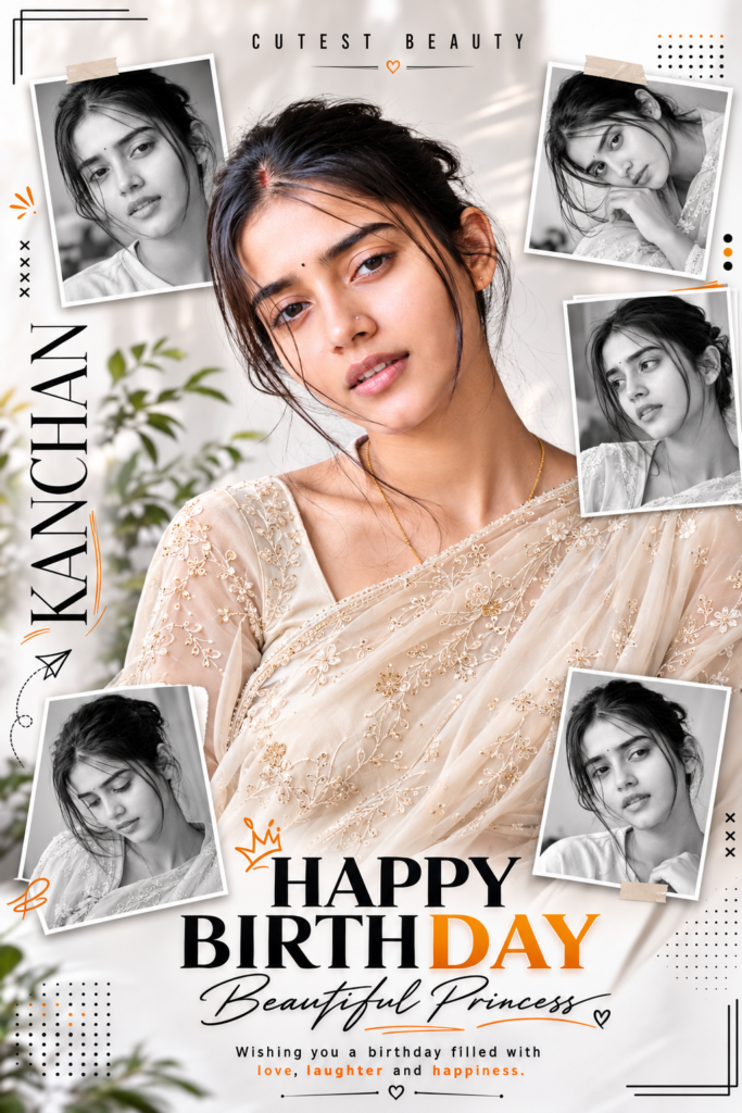
One detail that instantly elevates this look is the outfit choice — specifically, an ivory embroidered saree with visible fabric texture and delicate detailing.
There’s something about pairing traditional attire with a modern editorial layout that just works. It feels personal and rooted, while still looking like it belongs in a high-fashion spread. The soft ivory tone also does a quiet job of blending into a white minimalist background, so nothing fights for attention — the outfit enhances the portrait instead of overpowering it.
If you’re designing for a different cultural aesthetic, the principle still applies: pick an outfit with texture and heritage, keep the color palette neutral, and let it complement the background instead of clashing with it.
The Collage Layout That Makes It Feel Like a Real Magazine Spread
Single-portrait birthday posts are fine. But the ones getting saved and shared usually do something a little more clever — they build a small magazine-style collage around the main image.
One large central portrait stays the hero. Around it, smaller framed shots — often in black and white — add texture, different angles, and a bit of visual storytelling. It mimics the layout you’d see in an actual fashion magazine, and that familiarity is exactly why it feels premium.
This is also a favorite trick of luxury fashion campaigns for a reason: it keeps the eye moving across the design instead of landing once and leaving.
Why Black-and-White Framing Is Doing More Than You Think
Adding monochrome portraits around a full-color centerpiece isn’t just an aesthetic choice — it’s a hierarchy trick.
Your eye is naturally drawn to color first. So when the main portrait is in full color and everything surrounding it is black and white, the composition tells the viewer exactly where to look without saying a word.
It also adds:
- A stronger editorial, “shot for print” feel
- A cleaner, less cluttered overall composition
- Better storytelling through varied expressions and angles
- An aesthetic that ages well instead of looking trendy-but-temporary
It’s a small design decision with a disproportionately large payoff.
Minimalism Doesn’t Mean Empty — It Means Intentional
A common misconception is that “minimalist” means bare. It doesn’t. It means every element earns its place.
The best versions of this poster style use tiny graphic details to add polish without clutter — a dotted grid here, a thin corner line there, maybe a small cross mark or directional arrow, a single pop of orange or gold as an accent dot. Nothing screams for attention, but everything adds a bit of structure and personality.
Think of it like jewelry for a design — you don’t need a lot of it, you just need it placed well.
Typography Is Where Most People Get It Wrong
You can nail the photography and the layout and still lose the whole design with bad typography. This is where a lot of AI-generated posters fall apart — inconsistent fonts, awkward placement, text that fights with the image instead of complementing it.
The formula that works: pair one bold, wide-letter-spaced uppercase title for impact with one elegant script font for warmth — maybe used for a name or a signature-style message. Add a vertical name placement along one edge for that editorial magazine feel, and finish with a small gold or metallic accent color to tie it back to the “luxury” feeling.
Two font styles, used with intention, will always outperform five fonts fighting for attention.
Built for the Scroll: Why the Format Actually Matters
Design trends don’t go viral by accident — they go viral because they’re built for how people actually consume content. A vertical 3:4 composition is the sweet spot here. It fills the screen on Instagram Feed, Stories, and Pinterest without needing to be cropped, and it still looks sharp on a small phone screen, which is where 90% of people will actually see it.
A gorgeous design that gets awkwardly cropped on mobile is a design that fails. Format first, decoration second.
It Doesn’t Have to Stay Digital
The other reason this trend has real staying power: it doesn’t die the moment the post gets buried in someone’s feed. The same file can become a printed poster, a canvas print for the wall, a wooden or acrylic photo frame, a genuinely nice-looking birthday card, or even a phone wallpaper someone actually wants to keep using.
A well-designed birthday portrait has a way of turning into something people hold onto — not just another notification that gets swiped away in two seconds.
The Real Secret: Specificity Wins Every Time
If there’s one thing that separates a viral-worthy AI poster from a forgettable one, it’s this — vague prompts produce vague results.
“Make a birthday poster” gets you something generic. But describing the exact clothing and fabric texture, lighting setup and camera lens style, pose and facial expression, background and composition, typography placement and font pairing, color palette and accent colors, and photography style down to the grain will get you something that looks intentional.
AI image generators aren’t mind readers. The more visual direction you give them, the closer you get to that editorial, premium result instead of something that screams “I typed this in ten seconds.”
The Bottom Line
This poster style isn’t popular by accident. It works because every piece is pulling in the same direction — the styling adds elegance, the editorial photography adds professionalism, the collage layout adds storytelling, the minimalist graphics add structure, and the typography ties it all together.
None of it relies on loud effects or over-the-top decoration. If anything, it proves the opposite point: restraint, when done well, hits harder than excess ever could.
As AI image generation keeps getting sharper, this editorial-minimalist direction is quickly becoming the new standard for anyone who wants their birthday content to look less “template” and more “timeless.” Nail the details, and you won’t just post a birthday wish — you’ll create something people actually want to screenshot, print, and keep.